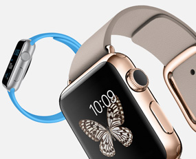
 Well, no surprise that Apple unveiled the Apple Watch today…but I was a bit surprised at how watch-like it looks. I really expected (hoped?) Apple would branch out and reinvent the wrist-worn device, but they’ve gone a fairly conservative route with styling and focused on software and usability instead. Which, in hindsight, I shouldn’t be surprised about. The watch isn’t shipping until early 2015, and we’ve only seen the tip of the iceberg in terms of what it can do. I think it’ll get a lukewarm reception overall, though when compared to the other recent entries in the marketplace (like the Moto360), it’s one of the better devices on the market. It does seem to offer some slick software features though..for example, if a friend texts you with an ‘either-or’ question, the software will recognize that and offer those two options as replies ready to send with a tap. I look forward to learning more about the Apple Watch over the coming months. In the meantime, check out the review at TechCrunch or the product page at Apple’s website for more info.
Apple Watch
