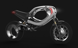
 When I saw this eBike concept from Frog Design, my initial reaction was, look at all that wasted space in the middle section where a larger battery could reside. It’s a trap I fall into sometimes…trying to optimize any design for function and performance, while ignoring what is perhaps the most important element of any product design.
Emotion.
That center void in the bike concept? It looks cool and creates flowing curves, further enhanced through the use of materials, colors, and illumination (check out some of the other pictures for that). The emotional attachment between a consumer and the product is absolutely critical. Not to say that technical performance isn’t, but you can’t have one without the other. Apple’s iPads and iPhones are great examples of that, where the form factor and graphical user interface create a welcoming experience for the user and ultimately a very successful product.
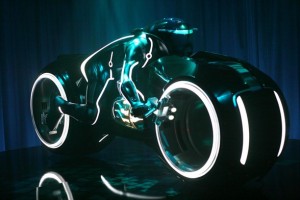
With the miniaturization of technology, more and more emphasis will be placed on the emotional side of design. I mean, who wouldn’t want to own a lightcycle if given the chance!

