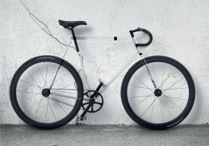
 By using a special type of plastic, designers at Designaffairs Studio made a bicycle with a transparent frame. It’s perfect for the cyclist who worries that they stand out too much in traffic and want to just be less visible. Yes, that’s a joke. I mean really, aren’t cyclists usually going out of their way to be MORE visible? Like the ‘light up like a Christmas tree’ bike light system I wrote about here previously.
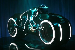
The one way I could see this transparent frame being of any benefit whatsoever is if you pack it full of bright LEDs, so you have a glowing frame. It wouldn’t help much during the day, but at night, no one is going to miss you!


